Case Study: Healthy Kidz - Rebrand
The Client
Healthy Kidz is a Health and wellbeing programme for children to increase physical activity, decrease teacher workload and improve pupil engagement.

The Challenge
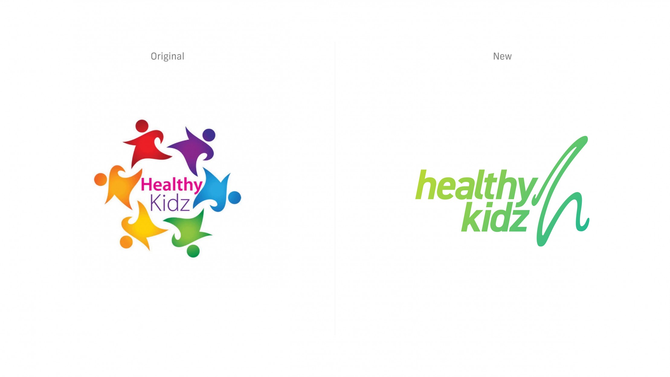
The task was to evolve the original Healthy Kidz brand identity through a refresh of their brand mark and its application. The old identity felt familiar through its use of stock iconography yet wasn’t unique enough to help make their brand memorable. Missing out on the chance for their visual identity to keep pace with the giant strides they’re making revolutionising health and wellbeing within the education system.
Through focus groups and brand exercises we found that the old logo wasn’t suitable for the new platform the team were developing, whilst the majority of staff and adults involved with the programme felt disconnected to the immature aesthetic of the original identity.

The Solution
After one meeting with the Healthy Kidz team, you come to share in the energy and passion that they bring to their collective mission. This energy is one that we wanted to showcase through the use of a bright and vibrant colour palette. Our main area of focus when creating the new brand mark was to bridge the gap between pupils on the programme and the adults delivering it. We achieved this through simplicity. A professional and contemporary logo that feels at home in both educational and sport settings.


