


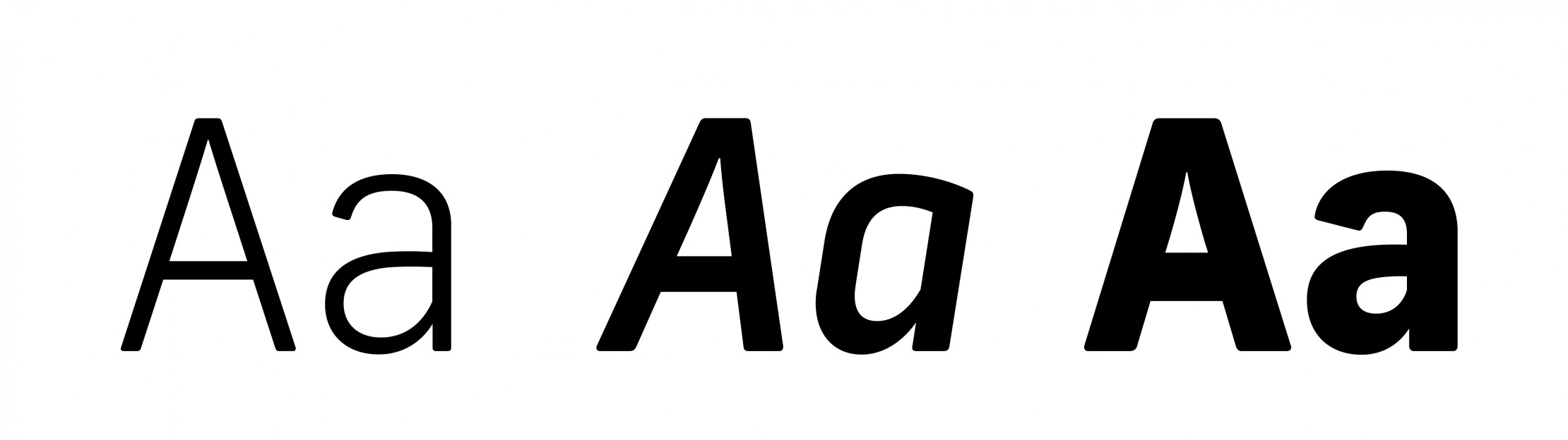
1. Understand font families
Using a few different weights from the same font family in your design can help to create a sense of unity within your branding. Be sure not to overuse these weights and styles (such as bolding or italicising words) as this will dilute the effectiveness of differentiating phrases from the rest of the copy and can make your design look busy or messy.
2. Use fewer fonts
When it comes to fonts: Less is more. There is a general rule within graphic design that you should stick to no more than 2 or 3 fonts within a single design or brand. Using multiple fonts and weights can make your design look messy and incoherent; and can make it difficult to discern the hierarchy of the piece of work.
Good practice is to select one font that will be used for headlines or titles and one font that will be used for body copy and larger blocks of text. When pairing fonts, make sure to choose distinctly different styles – for example, you could use a serif with a sans serif.
3. Kerning, leading & tracking
It is worth taking time to learn what is meant by kerning, leading and tracking, as these can make a huge difference to the overall design.
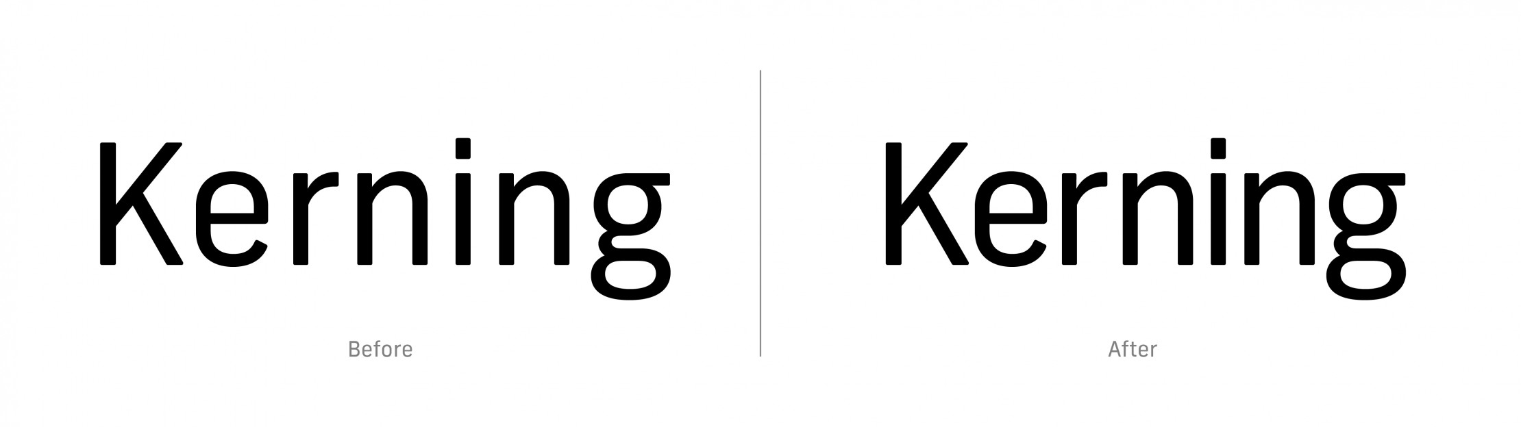
Kerning adjusts the spacing between a pair of letters, which enhances the visual flow between words and makes them easier to read when done well, instead of the letters being too close together or too far apart.
![]()
Tracking is similar to kerning in that it adjusts the space between letters, however it adjusts the space between all letters uniformly, rather than just a pair of letters.
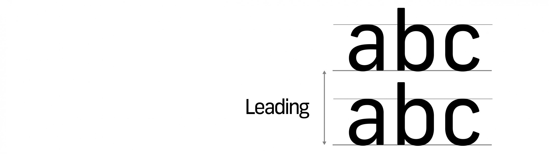
Leading refers to how lines of text are spaced vertically, which also affects the readability of text – if it’s too close, ascenders and descenders can overlap, and if its too far, it can be hard to read.
If you’re working on typesetting, it can help to look at the letters upside down, to allow you to focus on the shapes and white space without focusing too much on the letterforms.
4. Hierarchy
Hierarchy refers to showing the reader the order and importance of the different elements. Clearly distinguished font sizes and weights create a logical order in which the content of your design should be read and understood. The headline is usually the largest and most prominent part of the design since that is what should be read first. The sub-heading would be slightly smaller, and the body copy smaller again, and so on.
5. Don’t stretch fonts
Typographers put a lot of thought and meticulous attention to detail into creating a font – every letter is thought about and tweaked to achieve the most effective and legible shapes possible. That’s why stretching fonts is not a good idea. It distorts the shape, making the letters look ‘off’. People often do this in order to make a font fit better into a particular space. Instead of stretching a font, you should choose a taller or wider font to suit the space.
6. Readability
It’s easy to overlook readability whilst trying to achieve a certain look. The content of your design could be difficult to read if the font is too small or too large, if the tracking/leading is poor or if the colour of the text clashes with the background colour or doesn’t create enough contrast. For example, black text on a white background is always going to be easier to read than red on green.
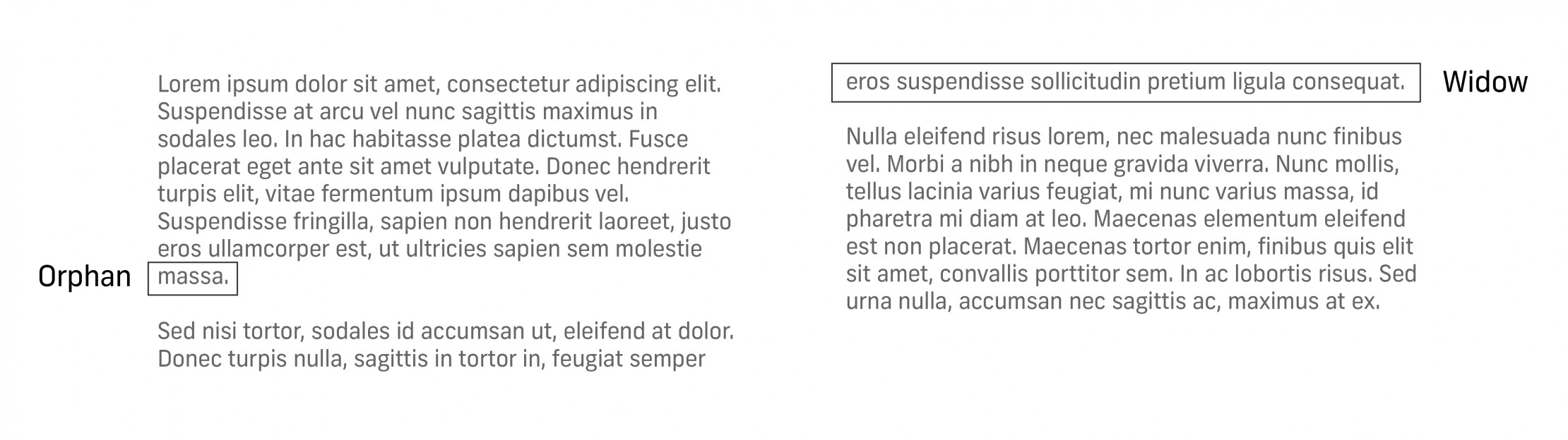
7. Widows & Orphans
A widow is a very short line of text, usually one word long, at the end of a paragraph, and is considered bad practice as it leaves a lot of white space between paragraphs and makes the text harder to read by interrupting the reader’s flow.
An orphan is a line of text that appears at the top of a new page following on from a paragraph on the previous page, thereby interrupting the flow of the paragraph by breaking it across 2 pages.
To avoid these, you can adjust font size, column width, or change the line breaks.
8. Ragged Edges
‘Rag’ refers to the uneven edges of a block of text. Since text is usually left-aligned, this is normally the right-hand edge of the paragraph. Ideally, you want to ensure that the rag goes in and out from line to line in small increments and does not create large areas of white space in the middle of the paragraph, as this will negatively affect the readability.
You can correct uneven rag by adjusting font size, column width, or by changing the line breaks.
9. Alignment
Alignment refers to the setting of text on a page. Text can be left-aligned, right-aligned, centred or justified. Non-designers tend to centre align copy but, with the exception of headlines, this is usually not a good idea as it forces the reader to look for the start point of each line, which makes the text much harder to read.
In general, for languages read left to right, you should left-align text for the best readability and flow. Avoid justification, as this is mainly used for newspapers where the column width is very narrow.
10. Use web safe fonts
To ensure your design shows up how it was intended on websites and emails, you should use a web safe font. This means that the font will be available on all devices and will look consistent throughout, instead of being substituted for a supported font if the one you selected is not available. Some web safe fonts include Arial, Helvetica, Garamond, and Georgia.


