

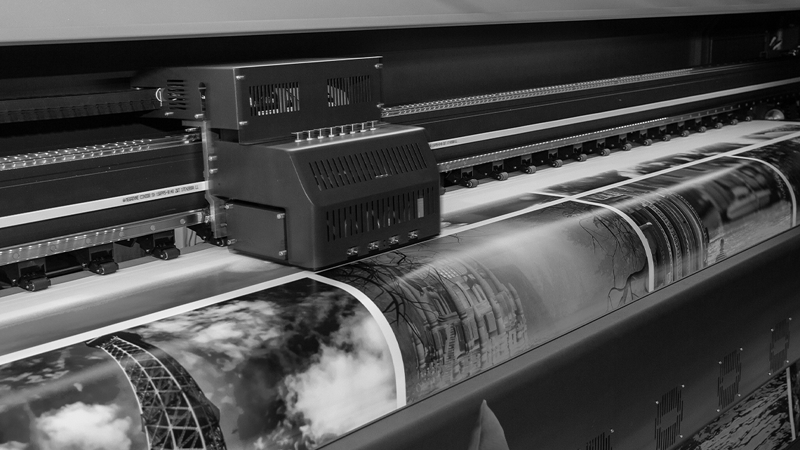
1. Colour modes matter
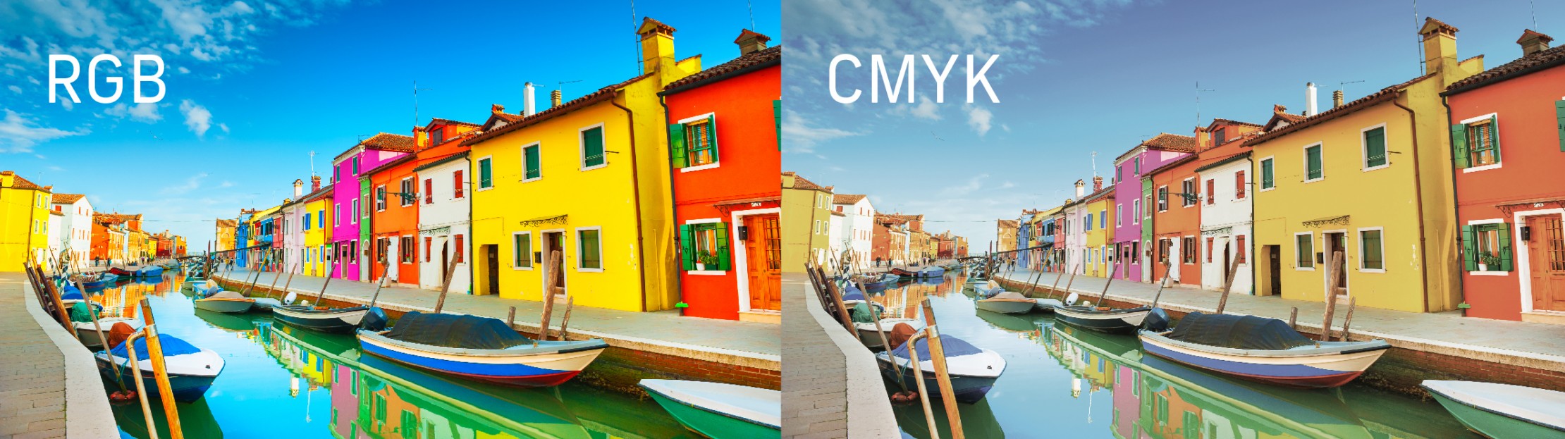
Most printers use a combination of 4 coloured inks – cyan, magenta, yellow and key (also referred to as black) – to bring your artwork to life on paper. This means that, in order to print correctly, images must be in the CMYK colour mode. A 4-colour printer cannot print colours outside of mixing these 4 inks together. Sending designers images in the CMYK colour mode ensures that the colours will remain consistent once printed.
RGB – meaning Red, Green, Blue – is the colour mode used by screens to create colours digitally. If an image is in RGB, converting to CMYK for print can cause changes in the vibrancy of the colours. This is because RGB has a wider gamut of colours than CMYK; CMYK can only produce a range of around 16,000 different colours, while RGB can produce 16,777,216 colours – quite a difference!
This is also true of spot colours, which includes specialist inks such as Pantone – CMYK cannot achieve the same depth of colour as Pantone inks can, and therefore must be colour matched to the closest possibility by eye to avoid huge discrepancies in colour.
2. High resolution imagery is crucial
Images must be at a resolution of 300 dpi, or 300 dots per inch, in order to print clearly. If the image is lower resolution than this, for example only 150 dots per inch, the image will pixelate and lose detail when printed, which can look low quality and unprofessional.
The best way to avoid this is to provide as high quality an image as possible when providing images, and where possible provide vector graphics such as Ai, PDF or EPS files when providing graphics like logos.

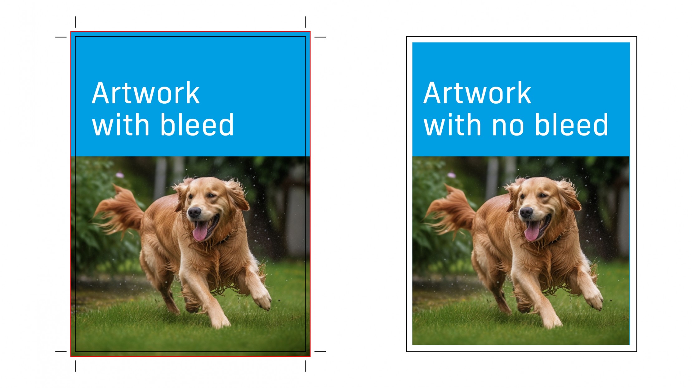
3. Do you need to add bleed?
Bleed is used when you need to print ink to the very edge of the paper i.e. with no white margins around the outside of the paper. Providing artwork with bleed means that there is an additional allowance of 3-5mm the entire way around a document. The printer needs to grab on to the edges of the paper in order to feed it through, and it cannot print onto the edges that it grabs on to. By adding bleed, you are not left with a white line all around your document, and instead colour and imagery can bleed off the edge of the page, with the excess being trimmed off after.
4. Know which kind of black you want
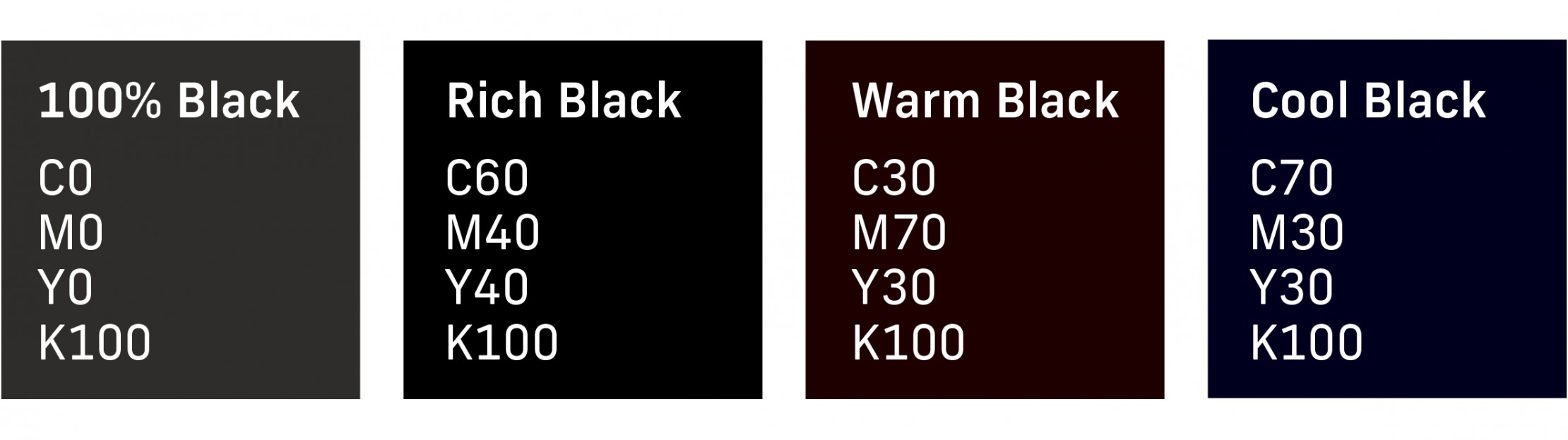
If you want to print black ink onto white paper, you might think it’s as simple as adding 100% K to your document. While this will certainly produce black as it uses 100% coverage of the Black Key ink, adding smaller amounts of the other colours available will produce a deeper richer black – also known as Rich Black. Rich Black might look like C60 M40 Y40 K100, however the amounts can be customised to make a cooler or warmer toned black. You may then be tempted to just max out all the colours to 100%, but what you need to be careful of is adding too much overall ink for the paper we’re printing on, which brings us to our next point.
5. Be mindful of ink coverage
If the ink coverage is too high for the paper type, you run the risk of the ink oversaturating the paper, which could result in buckling of the paper, or excess ink staining the paper – not good! As a rule of thumb, it is good practice not to exceed a total ink coverage of 280%, and 300% at an absolute maximum in certain circumstances. If we take Rich Black as an example, C60 M40 Y40 K100 adds up to a total ink coverage of 240%, which is within the maximum ink coverage threshold. However, if we were to max all colours to 100%, we get a total ink coverage of 400%, which is a recipe for disaster!
These are just some basics on how to provide assets to designers or printers for print. However, if you are ever unsure of anything, the best thing to do is to ask the designer or printer directly how they require the files to be provided to them.
If you’re working with us on a print job, please do not hesitate to ask us how best to send us assets and elements, or any print-related queries you may have – we will be happy to help to ensure that your design is printed exactly how you imagined.


