

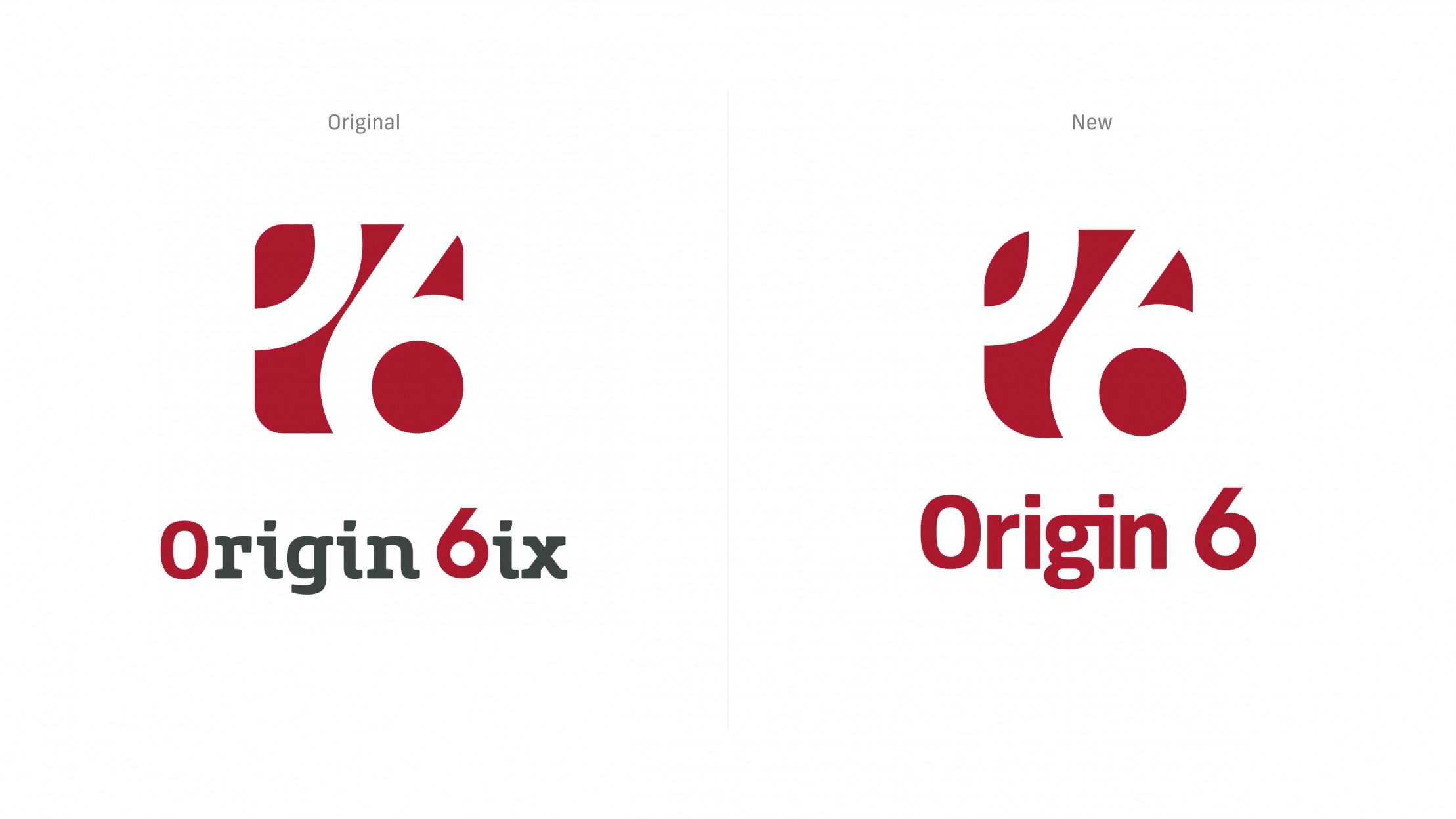
Case Study: Origin 6 - Logo Refresh
The Client
Origin 6 is a Business Consultancy based in Lisburn, Northern Ireland. Origin6 helps small and medium-sized businesses deal with the day-to-day issues they face, utilising a common-sense approach to help reduce the burden and allow Business Owners, Directors, and Managers to concentrate on driving their business forward.
The Challenge
Origin 6 approached Clever Ghost to help refresh their already existing brand identity as they felt that it had begun to feel tired and lacked a modern aesthetic that reflected their contemporary approach to helping businesses.
The Solution
After our initial discovery session with the client, we identified several areas within the old brandmark that needed to be addressed.
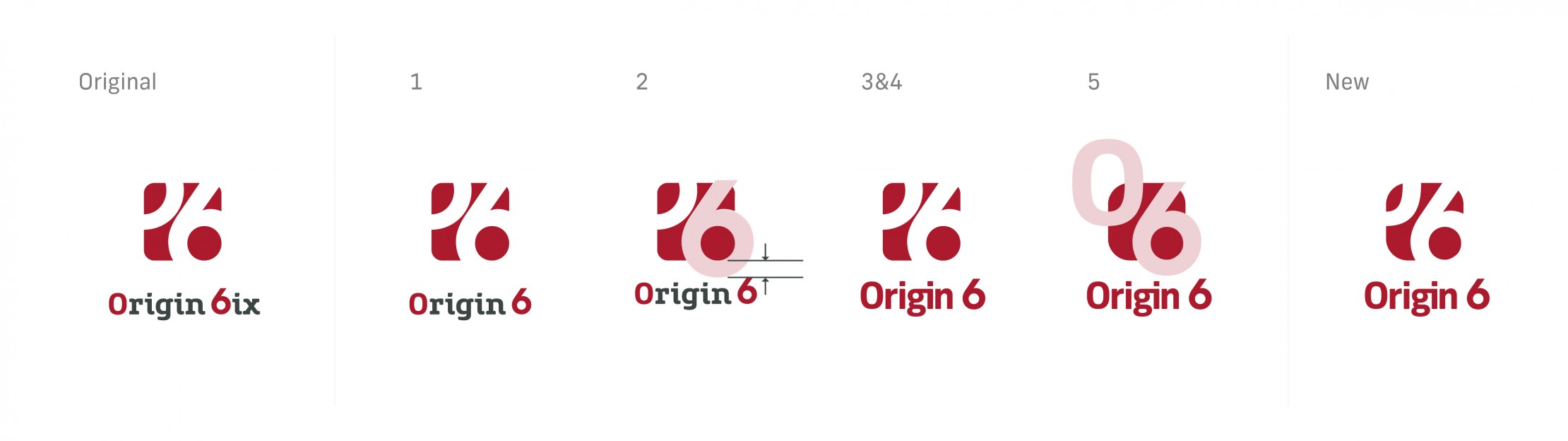
1. 6ix? Or Sixix? 6… or Six?
We removed the ‘ix’ from the end of ‘6ix’. The ‘ix’ diluted the impact of the number 6 within the name. By removing the ‘ix’ we also removed any confusion of how to pronounce the name that was highlighted during a previous focus session. Visually we were able to neaten up the overall shape and balance out the company name utilising the capital ‘O’ and number 6 at the end.
2. Spacing
The original logo felt disconnected with a large gap between the icon and wordmark. We reduced this space, resulting in a solid lockup that projected confidence.
3. Colour
Even with the previous issues addressed we felt that the addition of the 2nd colour to highlight the ‘O’ & ‘6’ was still one too many quirks that added nothing of value to the overall identity. We aimed to sure up the Origin 6 palette by rolling out the dominant red colour that was found in the original logo.
4. Typography
The original logo utilised 2 very different and contrasting fonts to create the original identity. This accompanied by the split colour palette made the ‘rigin’ & ‘ix’ feel alien to the rest of the logo. We set out to find a typeface that would unify the wordmark and icon. We chose a typeface that gave the identity a contemporary feel. We wanted to retain some of the characteristics of the old logo, giving a little nod to the original identity that the client was fond of being a part of by connecting the ‘g’ & ‘i’.
5. Icon
The original icon used the number 6 along with an ‘O’ to divide up the space, however, it was noticeable that the ‘O’ used was not the same font that was used below. We updated this to reflect the wordmark below and fixed any spacing issues. Lastly, we rounded the corners to reflect the same curves of the ‘O’ & 6 giving a much more cohesive look, creating a unique icon to crown the bespoke wordmark.


